CONVERSATIONAL USER INTERFACE DESIGN
Building UI with MCP's for faster checkout processes
Honestly, I don't understand why I cannot purchase things directly from ChatGPT. It is my personal assistant. I want everything to be in done in one single place.
I hate tab switching. Especially as a designer, who has 5 windows and 100 tabs for "inspiration".
Q.
How can we bring end-to-end checkout experiences within Conversational User Interface?
I want to build something which allows users to complete high-intent transactions without leaving the chat interface.
North Star? "Users complete purchases in fewer steps and less time compared to traditional web checkout."
OPPORTUNITY MAPPING
What are some high-intent categories for Conversational Checkout?
Where do users already use ChatGPT for planning?
Where does “intent crystallization” happen in chat?
The list below is from personal preference and can be extrapolated into different categories.
What do they have in common?
One thing I’ve noticed: users almost always start vague and refine as they go.
They explore. They compare. They click around. They change their minds.
So instead of making users go on a scavenger hunt… I brought everything together in one place.
Let's pilot with one product: Airbnb
WHY?
I started thinking about which product naturally invites conversation the kind where you have to explain your situation, your plans, your preferences. Planning a trip isn’t just clicking “buy.” It’s figuring out where to stay, what fits your budget, who you’re traveling with, what area feels right. It can honestly be pretty stressful.


Users Naturally ask questions like
"Where should I stay?"
"Which neighborhood is best?"
"Is this place good for kids?"
High-checkout abandonment
Users frequently compare options across multiple platforms.
A major opportunity to reduce drop-off.
Reassurance
Travel purchases carry emotional weight and becomes stressful
INTENT ARCHTYPES
What user intent can we catch?
Before brainstorming some solutions, let's look at what situations we can call the Airbnb's UI users might ask that can call Airbnb's API. Airbnb is no longer just accommodations it spans beyond it and each intent requires a different conversational pattern.
Example:
"I want to visit Lake Tahoe
with 3 friends.
I am driving up from San Francisco.
}
IDENTIFYING INTENT
CLARIFYING INTENT
{
Dates? [Suggest lower prices]
Budget? [Use previous bookings to suggest]
Activity preference? [Bundle with experiences]
Kids or pets? [Narrow down search]
STRUCTURING DATA
Now that we know what the user wants to achieve, we can form a data model
This works pretty well currently so we will rush past this topic. Using the intent data we can now call Airbnb's MCP to give us relevant information.
Chat
Intent
Data
User Interface
Payments
Confirmation
BRAINSTORMING SOLUTIONS
I did not think about the goal or the problems, I just sketched…
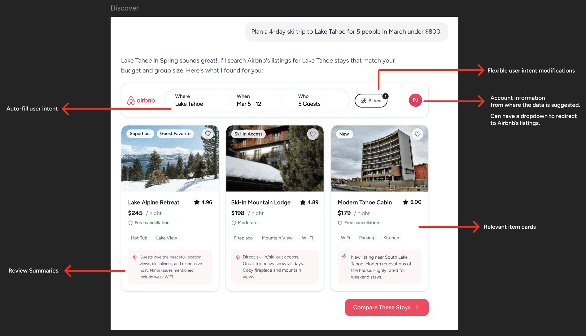
I took out the old Apple pencil and iPad and began to sketch. The first thing that popped in my head was "Relevancy". Once the intent is known, ChatGPT can call Airbnb's MCP to showcase relevant information according to user expectations. ChatGPT becomes an orchestration layer which is unified by Airbnb’s backend commerce engine.


I had 2 ideas in mind. One was having a singular card with all the details. Second was having individual cards which can be tailored according to the intent of the user. They both would same user flow.
I then turned ideas into concepts…
Users decide with images. The vibe, the aesthetic and view.
Property image carousel

Users want to know what previous guests said about the place.
AI Summaries

Users want to make an informed decision.
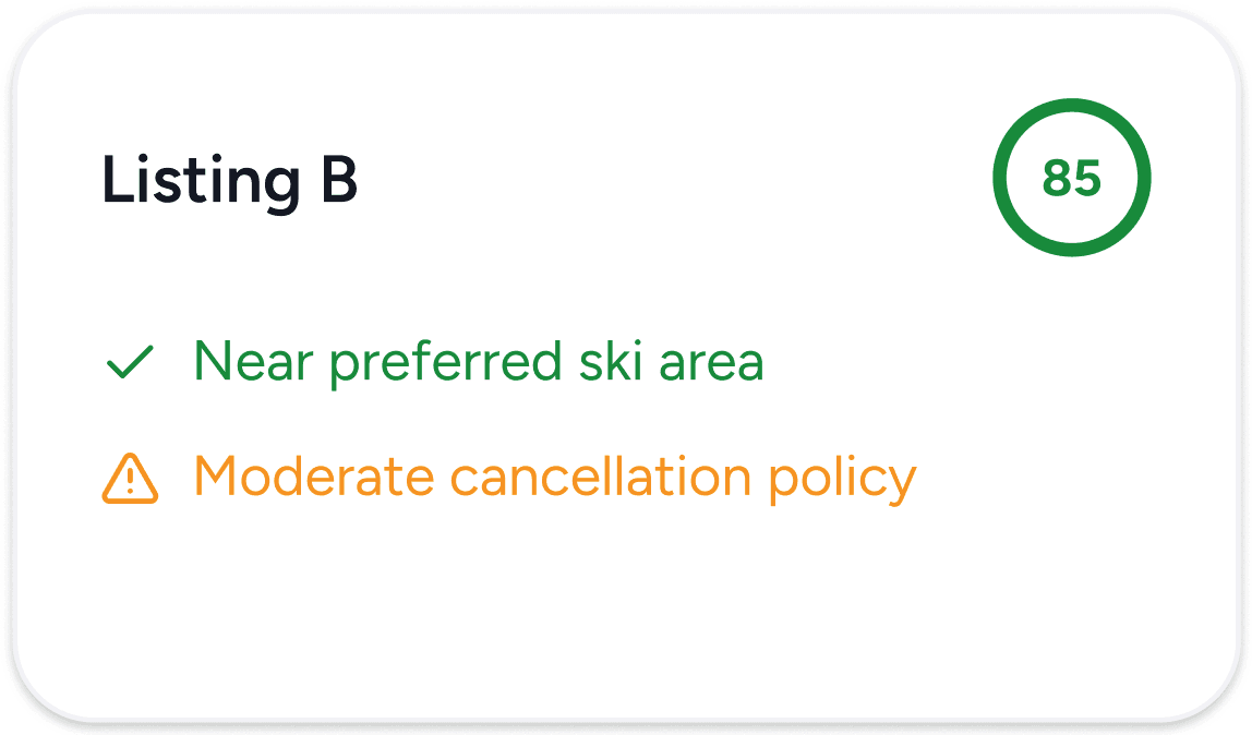
Confidence Scores
Users want to compare the properties side by side
Comparison Table

DESIGN ELEMENTS
I contextualized individually, and brought them back together…
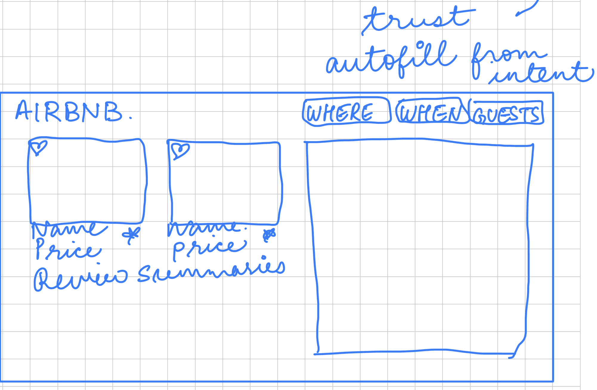
The goal during this exercise was to ensure the user never had to leave the interface and were able to identify all the information on that single page. One of the great things about ChatGPT is that it currently has a lot of white space which can be utilized dynamically according to experiences. We will focus on Booking and Reservation.
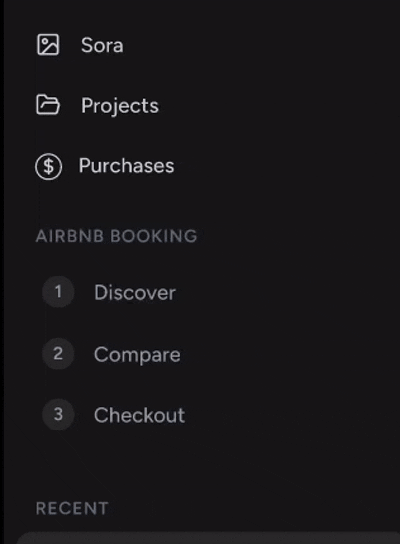
Which would have 3 layers. Discover, Compare and Checkout.
AND it can be reused for all the use-cases mentioned above under Opportunity Mapping section. WIN-WIN!
Discover
This is where users go from "I want a trip" to "I want this place." It goes beyond a search box. My goal was to capture location, dates, guest details, price range, and filters upfront, to shape the search around real intent. Showing three strong listings with clear insights and basic information keeps things focused and avoids analysis paralysis.
Compare
I designed the comparison view to eliminate the mental tab exhaustion. Instead of forcing users to flip back and forth between listings, I placed three properties side by side in structured, scannable rows. I aligned the decision making factors so the trade-offs become instantly visible and reduces decision fatigue. I also introduced a confidence score as a subtle decision-support mechanism. Not a generic popularity badge, but a personalized signal based on previous bookings and how closely a property matches the user’s stated preferences.

Checkout
I designed the final step to reduce last-minute friction and reinforce trust at the most sensitive moment of the journey.
Instead of overwhelming the user with a long form, the layout is structured into clear, scannable sections. The selected property appears at the top with location, dates, guest count, and rating; anchoring the user in context so they never question “what am I booking again?”
Primary actions like Modify, Add to Calendar, and Contact Host are embedded within the card layout. This keeps escape routes available without forcing users to leave the checkout flow allowing controlled flexibility.

FULL PROTOTYPE


