TL;DR – How I turned a 136-component Design System kit into a versioned, installable React library – with Claude doing the design-to-code translation. Airtight. Shipped.
Aug 24, 2026 | 10 min read
AI is as good as the data I feed into it.
It took me 8 months to build and adopt the NUU Design System on

but let's blow past it.
While the design system was built to ensure scalability and consistency on the designs as the team grew, there was a huge gap…
THE PROBLEM
Figma Dev-mode is good, but it still requires time from the devs to manually implement it. We didn't have a separate design-system repo on github; or Frontend Engineers. My tokens and components lived only in Figma, so translating a screen into code meant manual re-implementation every time - with no guarantee it matched.
At 136 components and growing across parallel branches, I knew that gap would only compound: the bigger the file got, the more expensive every hand-off would become.
GOALS
Why do I want to build this?
01 SSOT
02 Scalability
I wanted it installable like any real npm package, not a folder devs copy-paste from. The fixes flow two-way; Design & Code
03 AI-First
I didn't have a dedicated frontend team yet - I had to build this myself, using Claude as my technical multiplier
THE WORKFLOW ARCHITECTURE
Systems Thinking: How I Structured the Design System
ONE SHARED SYSTEM
Figma <-> code
01 / CONFIG
Colors, type & logos
shared primitives underneath everything - every branch and every component pulls from this layer rather than defining its own values.
02 / BRANCH
Branch 1
Branch 2
Branch 2
Parallel work, reviewed together
03 / MASTER
Master file + code vocabulary
I mapped Figma variant names directly to React prop names; never translating vocabulary between design and engineering.

I used Figma MCP to read design context directly off selected nodes instead of manually transcribing values myself.
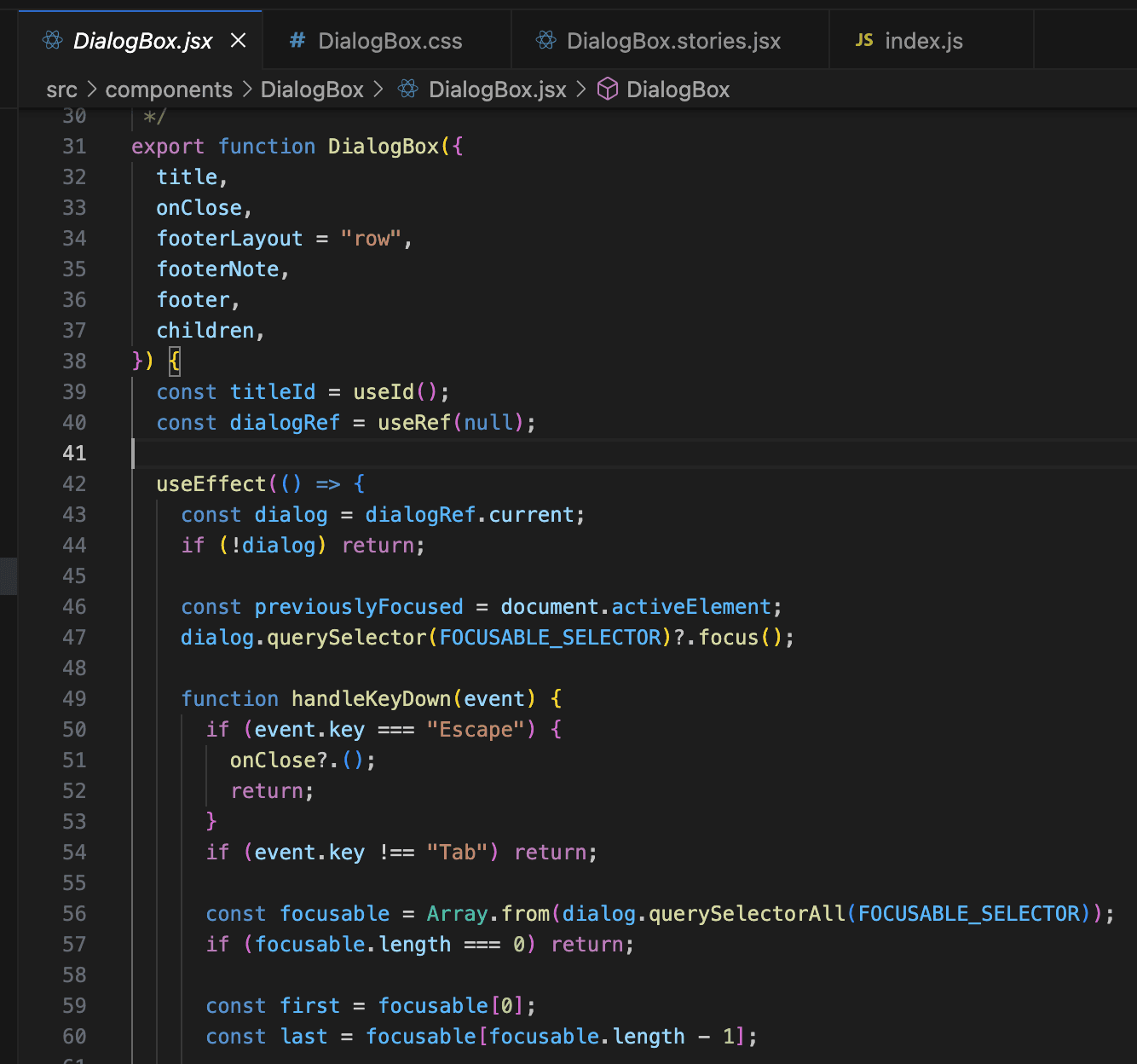
I used Code Connect to map Figma component properties (variants, instance-swap slots, booleans) to real prop names in my codebase, so pulling a component gave me working props like
<TextField icon={<SearchIcon />} />instead of hardcoded, uneditable markup.I used Claude Code to assemble the actual component files, keep Storybook stories current, and package the library (Vite build, dual ESM/CJS output, proper
exportsmap) so it installs like any other npm dependency.I built in a feedback loop - code fixes flowing back into the master file - which is the part most handoff pipelines skip. It turned this from a one-way export into an actual two-way system.
DECISIONS & TRADE-OFFS
It's not a perfect world…but we can get close :)
Plain CSS custom properties
Matched my token-first mental model; framework-agnostic for whatever the eventual app team uses
More manual work per component than utility classes
Branch-based Figma structure over one flat file
Let me scale 136 components without a single unreviewable file
Added merge/reconciliation overhead between branches
Packaged as an installable npm module vs. a components folder to copy
Gave me a real versioned single source of truth, updatable via npm update
Requires the dev team to adopt a package workflow instead of copy-paste
Sampled key states over every variant × state combination
Got a usable v1 shipped faster
Left explicitly flagged gaps for me to close later
IT COMES TOGETHER
Same component; different boards
I found Claude fastest at the translation - token values, boilerplate component structure, packaging config. But anywhere I hadn't yet formalized a property in Figma (like icon slots on TextField), the pipeline could only guess; deciding whether to accept that guess or go back and define a real Figma property was still a call only I could make, not something the tooling could resolve for me.
Figma Component
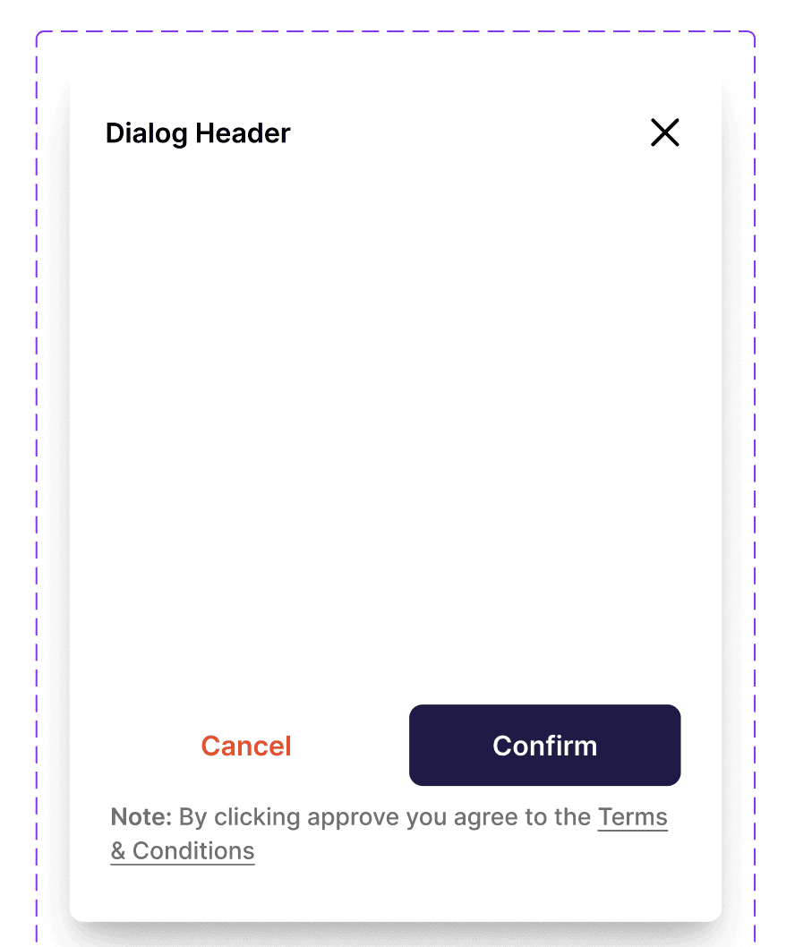
The Code
Storybook UI

PeerConnect
Nuuvia
Threads & Beads

I hope I left you with some curiosity…
Have an Idea? Let's Collab!



Made with lots of
by Prachee
2026